- Designed for your business
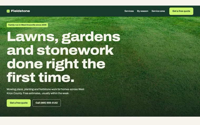
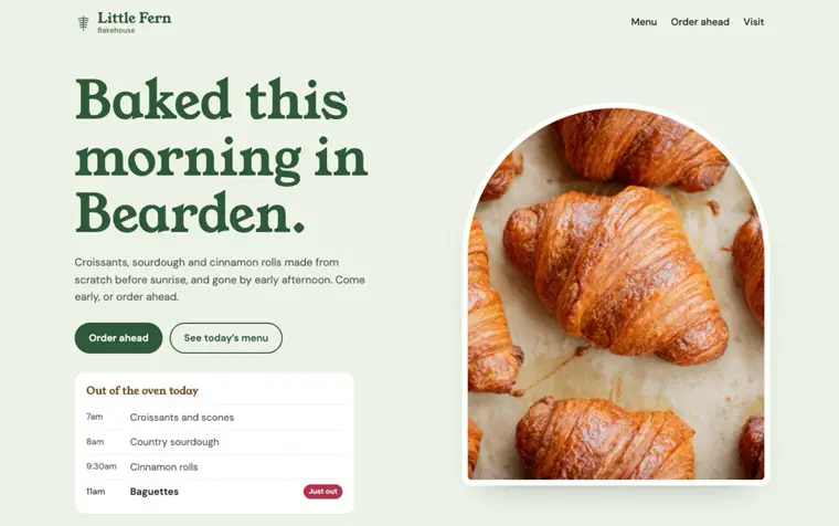
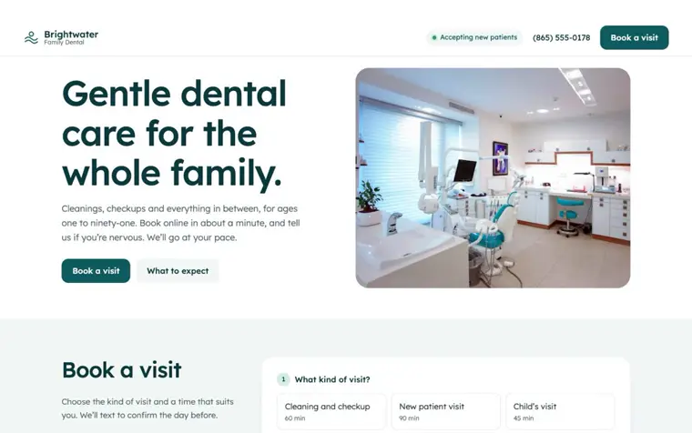
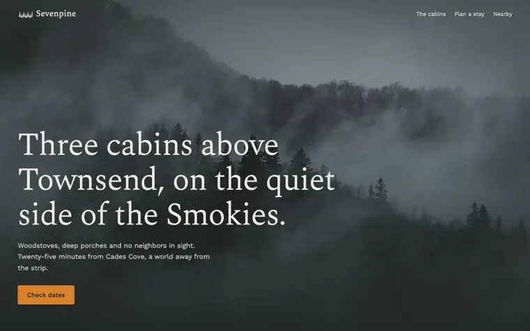
- A look built from your trade, your town and your customers, not a template with your logo dropped in.
- Type and color with a reason
- A small, deliberate palette and typefaces chosen to sound like you, used the same way on every page.
- Clear at a glance
- Visitors find the thing they came for, whether that’s hours, prices or a phone number, in seconds.
- Photos that look like you
- Your own photography, carefully cropped and color-matched, or images chosen so tightly they feel commissioned.
- Motion that helps
- Small, considerate movement that shows what changed. Nothing that makes people wait or feel seasick.
- Designed for the phone
- The phone layout is designed on its own, because that’s where most of your customers will see it.
- Fast on a weak signal
- Pages are built ahead of time and served from a global network, so they load in a blink, even in a parking lot.
- Works for everyone
- Readable contrast, keyboard access and screen-reader labels, plus the details Google needs to show your hours and location.